🚧 DatePickerIOS
Deprecated. Use @react-native-community/datetimepicker instead.
Use DatePickerIOS to render a date/time picker (selector) on iOS. This is a controlled component, so you must hook in to the onDateChange callback and update the date prop in order for the component to update, otherwise the user's change will be reverted immediately to reflect props.date as the source of truth.
DatePickerIOShas been merged withTimePickerAndroidandDatePickerAndroidinto a single component called DateTimePicker and will be removed in a future release.
Example
import React, {Component} from 'react';
import {DatePickerIOS, View, StyleSheet} from 'react-native';

export default class App extends Component {
  constructor(props) {
    super(props);
    this.state = {chosenDate: new Date()};

    this.setDate = this.setDate.bind(this);
  }

  setDate(newDate) {
    this.setState({chosenDate: newDate});
  }

  render() {
    return (
      <View style={styles.container}>
        <DatePickerIOS
          date={this.state.chosenDate}
          onDateChange={this.setDate}
        />
      </View>
    );
  }
}

const styles = StyleSheet.create({
  container: {
    flex: 1,
    justifyContent: 'center',
  },
});
Reference
Props
Inherits View Props.
date
The currently selected date.
| Type | Required |
|---|---|
| Date | Yes |
onChange
Date change handler.
This is called when the user changes the date or time in the UI. The first and only argument is an Event. For getting the date the picker was changed to, use onDateChange instead.
| Type | Required |
|---|---|
| function | No |
onDateChange
Date change handler.
This is called when the user changes the date or time in the UI. The first and only argument is a Date object representing the new date and time.
| Type | Required |
|---|---|
| function | Yes |
maximumDate
Maximum date.
Restricts the range of possible date/time values.
| Type | Required |
|---|---|
| Date | No |
Example with maximumDate set to December 31, 2017:

minimumDate
Minimum date.
Restricts the range of possible date/time values.
| Type | Required |
|---|---|
| Date | No |
See maximumDate for an example image.
minuteInterval
The interval at which minutes can be selected.
| Type | Required |
|---|---|
| enum(1, 2, 3, 4, 5, 6, 10, 12, 15, 20, 30) | No |
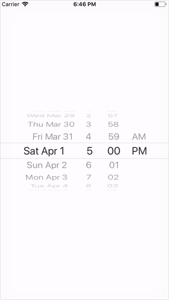
Example with minuteInterval set to 10:
mode
The date picker mode.
| Type | Required |
|---|---|
| enum('date', 'time', 'datetime', 'countdown') | No |
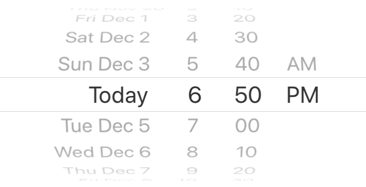
Example with mode set to date, time, and datetime: 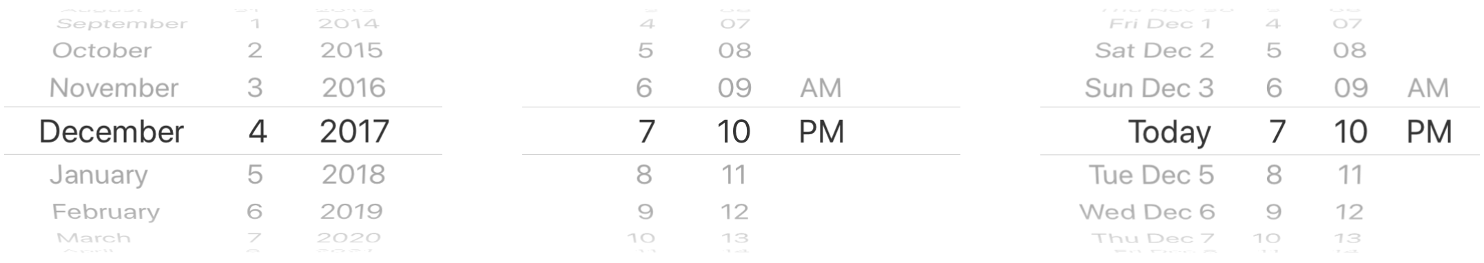
locale
The locale for the date picker. Value needs to be a Locale ID.
| Type | Required |
|---|---|
| String | No |
timeZoneOffsetInMinutes
Timezone offset in minutes.
By default, the date picker will use the device's timezone. With this parameter, it is possible to force a certain timezone offset. For instance, to show times in Pacific Standard Time, pass -7 * 60.
| Type | Required |
|---|---|
| number | No |
initialDate
Provides an initial value that will change when the user starts selecting a date. It is useful for use-cases where you do not want to deal with listening to events and updating the date prop to keep the controlled state in sync. The controlled state has known bugs which causes it to go out of sync with native. The initialDate prop is intended to allow you to have native be source of truth.
| Type | Required |
|---|---|
| Date | No |